Branded by Design
How do you "flip" a hotel and give it new life? Planning, getting the basics right and knowing your brand inside and out

George Wong is no stranger to the concept of “flipping” a hotel – transforming it from one thing into something totally new, and, in the process, refining the brand message that fits hand-in-glove with the brick and mortar of the building itself. Wong and his New York-based company, GeorgeWongDesign, (georgewongdesign.com) have been tasked with building hotel interiors all over the world for brands like Park Hyatt, Edition, JW Marriott, and more.
The Hong Kong-born designer was tasked with transforming the one-time Nikko Hotel in the well-heeled Polanco neighborhood of Mexico City into a new Hyatt Regency Mexico City. The revitalized property needed to lure business travelers with the latest technology, trend-forward work and lobby spaces, and a connection to its guests which affirmed the brand’s identity.
Business Traveler sat down with the hospitality designer to get inside the process of how a hotel comes to life from the inside out. Wong laid bare the blueprint of a hotel being reborn into a new brand, and even reviewed the hotel himself, as a guest, after his own designs had been implemented.
BT: How did you connect with Hyatt Regency, and how were you chosen for this particular project?
WONG: It was late 2012 when I received a Request for Proposal for a potential conversion project in Mexico City. Prior to submitting the proposal, I met with the entire technical service team in Chicago to obtain a better understanding of the visions and goals of the project. It was then when I found out that it was the taking over of the then Nikko Hotel in the Polanco area which is the upscale part of Mexico City.
BT: What was your first in-person meeting like?
WONG: The first meeting in Chicago involved engineering, operation, food and beverage, architecture and interior, and so on. They went through all the images they took over their initial visit six months before. It was overwhelming because there were so many images and without visiting the project in person, I had no idea which was what and where. Initially, it was a moment of info-overload.
It was 2013 when I first visited the hotel with the hotel team, two weeks before the handover to new ownership and new brand. We were there as a “pre-takeover survey” team. But since the handover had yet to happen, we had to respect the then current hotel, and the staff in particular, so as not to create unnecessary anxiety among the employees and hotel guests. The purpose of the visit was to walk me through the spaces so that I could jump right into designing the hotel when I returned back to New York City.
BT: What did you think when you first saw the existing hotel?
WONG: When designing for conversions, I tend not to take in the existing design elements but instead study the quality of the spaces and possible guest circulation patterns, and note the limitations such as structural elements that the design will have to respect.
My first impression was “this has potential.” The hotel was built in the 1980s Brutal Style, with exposed concrete elements on the exterior and extending to the interior spaces. There’s a nice quality of these concretes, and I decided to leave them alone as they are authentic to the architectural style of the building.
BT: What was biggest challenge in this redesign?
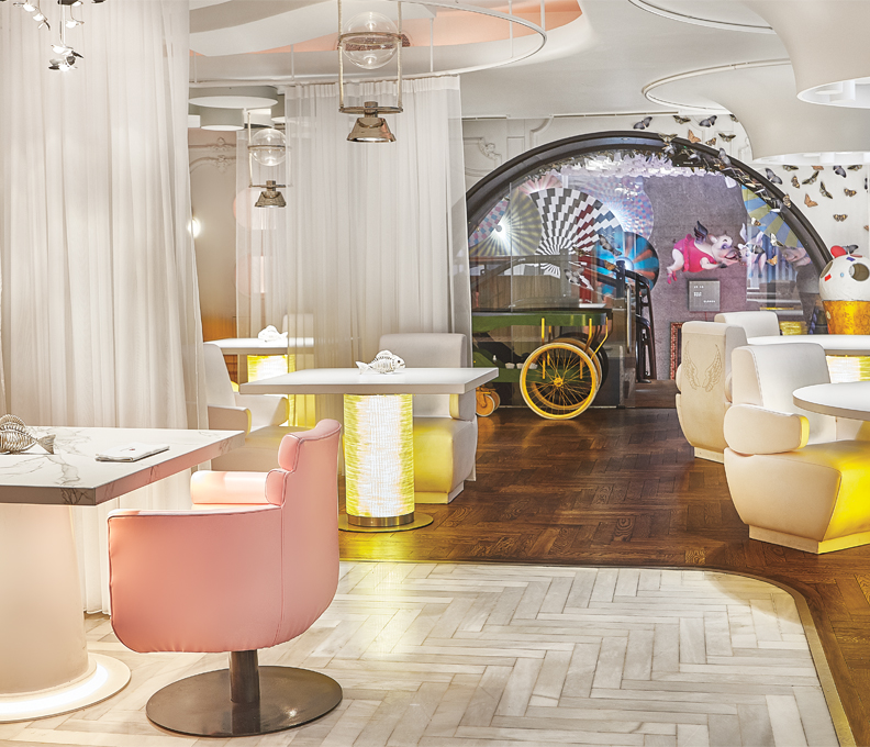
WONG: The vastness of the atrium floor was the most challenging because it was like an open yard where one could roam around without any anchor or point of reference. One could easily get lost there. There was a sea of tables and chairs with a tiny bar counter which was hardly visited during the day and much less so at night.The brief asked for converting the atrium floor to become the center of activities for guests, meaning it had to be the extreme opposite of what existed.
I went back to our studio and started brainstorming with the team. We did extensive research about Mexican culture where community plays a big part in their everyday lives. I remembered an article on city planning by Jane Jacobs about the importance of using “parks, squares, and public spaces as part of the urban fabric, intensifying the fabric’s complexity to foster a functional identity at the district level…” In other words, a community with a sense of place.
Thus, the concept of the “Zocalo” (a Mexican market square) was born, as a mash up of market place and town square, public park, surrounded by destinations such as cafés, bars, restaurants and patisseries. With that concept, we developed each of the integral elements into a modern design that is relevant to the habits and expectations of today and tomorrow’s business travelers.
BT: Are there design themes that are replicated throughout the entire property?
WONG: The repeating motif of clean lines and warm tones without frivolous decorations resonates throughout the entire project, not unlike a smart business person who travels lightly, and who is focused and effective at what he or she does.
BT: What design aspect most affects business travelers in this property?
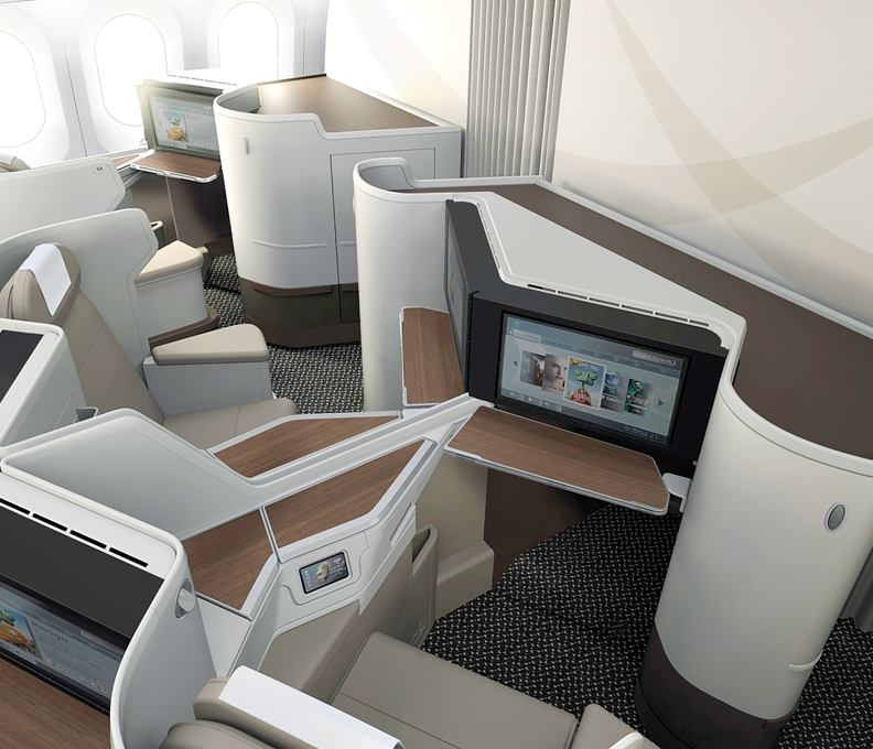
WONG: The design of the meeting facilities, each with their own characteristics and styles, caters to an array of needs and expectations of business travelers. The saying that “no one can please everyone” does not apply here. Anything from huge conferences in the ballroom – one of the largest in Latin America – to person-to-person meeting at the Rolfo lounge on the atrium floor, and everything in between.
Each has its own character and flexibilities. The Atelier rooms, in particular, are meeting spaces with chalk walls, white board walls, high and low casual style lounge seating, glass panels for doodling but that also slide in front of a TV as a “tracing paper” so guests can do “markups” right on the PowerPoint. These are new designs to fit into the trend of emerging meeting styles.
BT: What other design elements did you add into the mix?
WONG: Although the hotel was designed primarily as a business travelers’ hotel, it does not steer away from the warm and hospitable ambiences that are intrinsic to high-end hotels. I chose to use textures, colors, sculptural forms, and architectural installations that are located strategically around the atrium floor and lobby.
None of these are high tech. Instead, they are all handmade by local craftsmen and artisans. The white ceramic wall with a thousand discs, the live green wall that stretches two levels, the oversized red painting behind the front desks, screens that stretch three stories, all create a sense of warmth that responds to human nature.
BT: Is there anything specific to the Mexico City locale in the design?
WONG: Mexico City is, in fact, a very modern and cosmopolitan city. Despite the long history of Mexican culture, the city thrives with modern architecture and lifestyles, with one of the friendliest people on the planet. That, too, informed that the design should be modern urban, complex but sleek and welcoming.
BT: What aspect of the hotel are you most proud of?
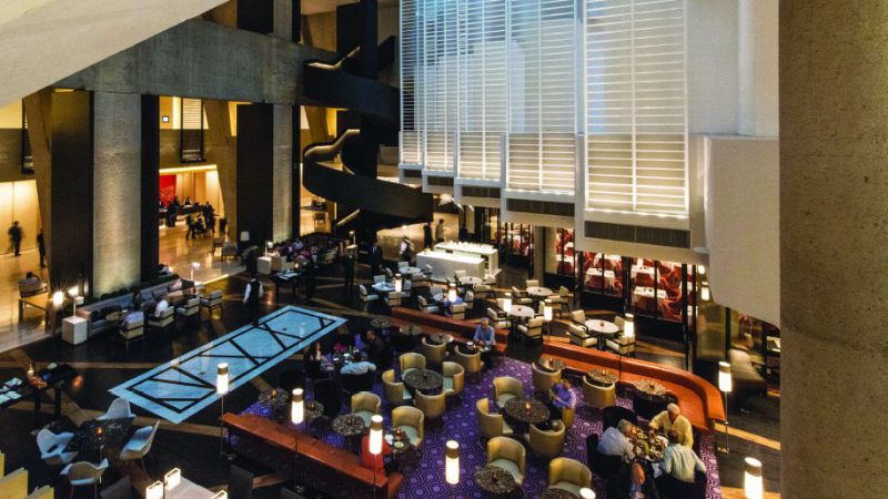
WONG: The transformation of the lobby and the atrium floor, I believe, are the most successful areas of the project – to a point that there was not a trace of the previous iteration of the same space. I filled up sunken floors, removed water features, and carved a restaurant inside the atrium floor, surrounded by bar counter, café, patisserie and candy store. It turned what used to be soulless space into a hopping public space that is lively, accessible, and owns a sense of community.
BT: Do you feel the hotel stands out from the Hyatt brand, or blends into the brand seamlessly?
WONG: I believe, with the few Hyatt hotels I worked on, this is a perfect envelope for the Hyatt Regency brand which is specifically business traveler-centric with ample meeting spaces.
BT: What was it like to actually stay in the hotel you designed after it opened as a Hyatt Regency?
WONG: In 2017 I traveled there for business, and of course, stayed in the Hyatt Regency. As the end user, and by nature of professional hazard, I could not help but scrutinize every aspect of every hotel in which I stay for business. The suite I booked was no exception. The entry experience was spot on: bright vestibule, a bench for dropping my bag and a ledge to place my key card.
I checked in during the day, and found the living room a little dim, overpowered by the daylight that filtered through the window. The hotel is a high rise building with an unobstructed aerial view of the city and an almost infinite vista towards the mountains beyond. On hindsight, I think I should have proposed glare-cut film to all rooms and suites on the upper levels.
The L-shaped walk-in closet fitted nicely in the corner before entering the master bath. The bathroom came out nicely as expected. I found myself looking better in the vanities mirrors because of the diffused light coming out from their sides. It is not about how nice the mirrors are designed, it is about how good they make you look in them, a criteria I always stress in my bathroom designs.
I left for a meeting, and it was evening when I returned. The impression upon entering the suite was very different from the daytime. The living room felt warm and cozy when lit by the soft lighting from the floor and table lamps. It was as residential as I had envisioned. The long console opposite the bed intersected with a wide full height wood panel on the wall which housed the TV. Together they created a Bauhaus-like graphic composition which I thought was successful.
How many travelers care about Bauhaus anyway? I contemplated the question with closed eyes and Miles Davis in the background. I did not have an answer. But I was unwinding after a hectic day, relaxing in an environment that did not remind me of being in a hotel, and well-rested to get ready for the next day’s work.
As a business traveler myself, what more can I ask for?